14th Nov 2017
How might we...
...explore new motion, gestures and controls for privacy choices
Helping people understand how their personal data is used in an app, can add many steps to the interface, but it's also an opportunity for people to feel informed and in control.
Kin is a photo sharing social network for your closest friends and family. In order to provide the service, Kin is powered by some of the following data:
For services based on displaying and sharing personal content - such as text, photos and videos - being transparent about how the content is used is of utmost importance.
The cross-functional Design Jam team challenged themselves to consider how people could have far greater control over each piece of content they share, with greater visibility into the meta-data.
How might we...
...explore new motion, gestures and controls for privacy choices

Kin's team prototyping
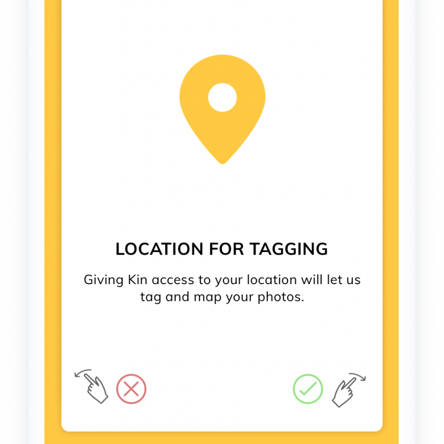
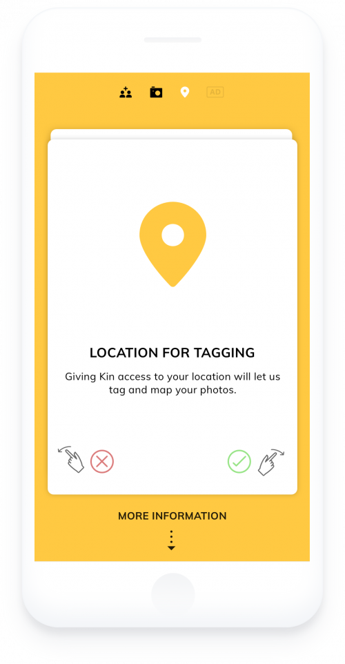
When it comes to managing data privacy settings, especially upon sign-up, people can blindly skim through privacy information and options as fast as possible. Kin, on the other hand, makes you engage with it by breaking it down into simple, visually compelling stages. It asks for four pieces of data during sign-up:
Instead of bundling these data requests together into a single consent, which can feel both overwhelming, Kin takes you through each request individually, explaining the value exchange for each. This may seem counterintuitive when product teams can believe that too many stages in the interface are detrimental to sign-up; however, Kin gets around this by making the interaction both engaging and visually compelling.
Through the use of simple, Tinder-like swipe functionality, people can more clearly understand the consent they're giving at every stage, and can get as much or as little information as they wish, with the option to swipe down if they want to know more. In this way, people have a better idea of what they're signing up for, rather than leaping into the dark.
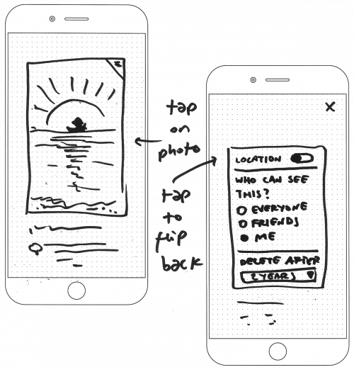
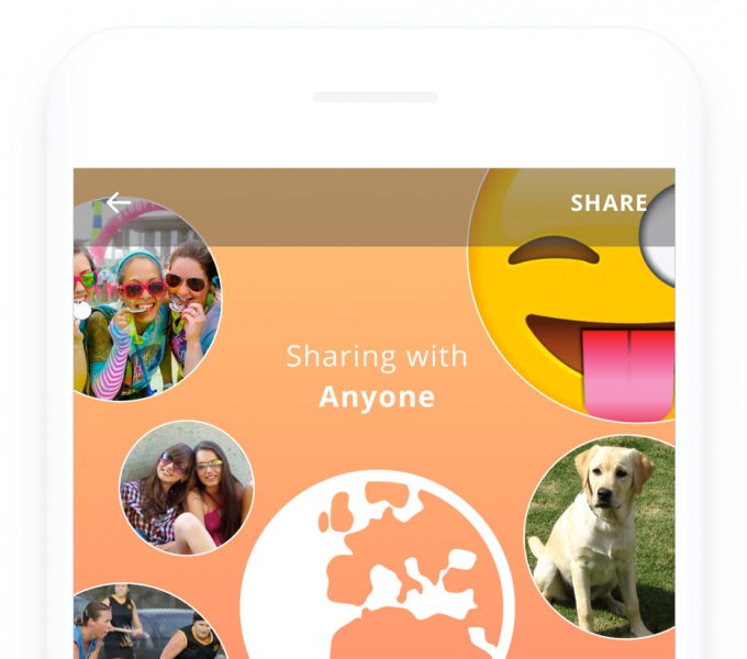
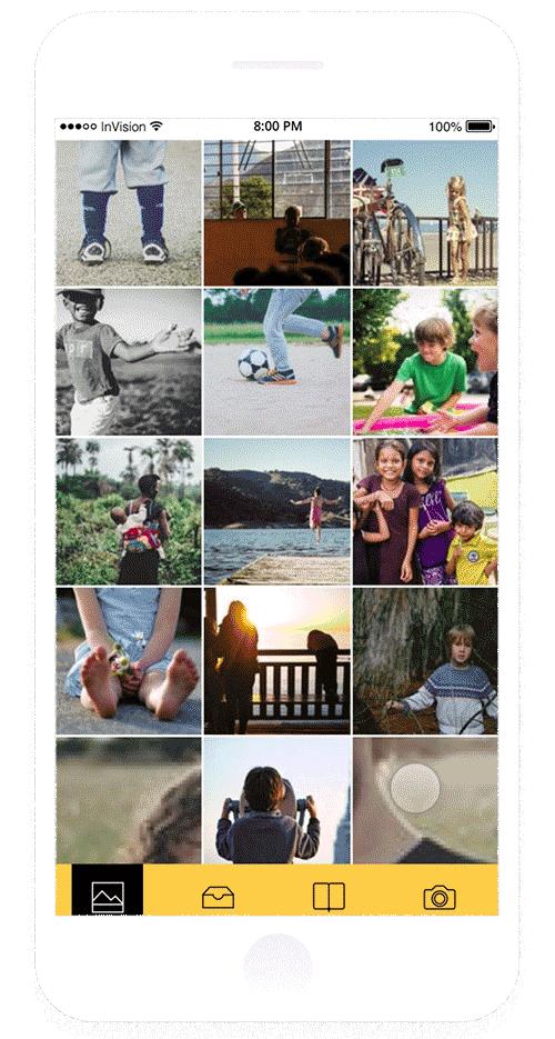
For every photo on Kin a person can view and control data shared alongside it: the picture's location, the friends with whom the picture is shared, as well as whether the information can be used to provide targeted advertising.
While viewing a photo on the album page, people can see the relevant meta-data that's associated with it at the top of the interface. The icons become more visible, letting the person know which data is connected to it. Touching the photo reveals the meta-data in more detail and provides controls.
How might we build on Kin's ideas to...